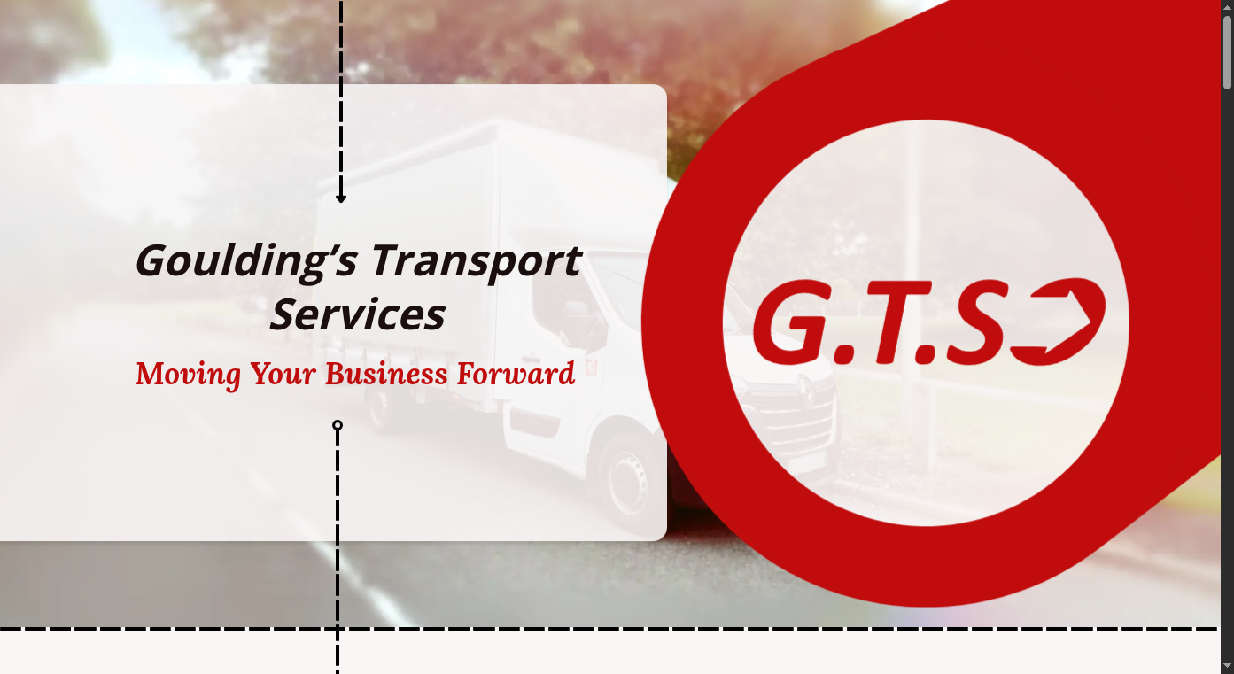
Gouldings Transport Services
Overview
This was a fun client project which really tested my design and development skills.
I was up front with the client that while I’m a very confident developer, most of my previous client work has been done in collaboration with a design team. This one would have me creating a design from scratch with minimal client provided assets. Getting stuck into the project I was excited to learn something new and do the best I could.
My aim was to create a light, inviting design, which would use visual transport metaphors to draw the user through the page and towards key CTA buttons and information. As such, I leaned heavily on dotted lines and arrows to create flow and layout opportunities. Finally sprinkling in scroll-driven and intersection observer animations to grab attention and create interest.
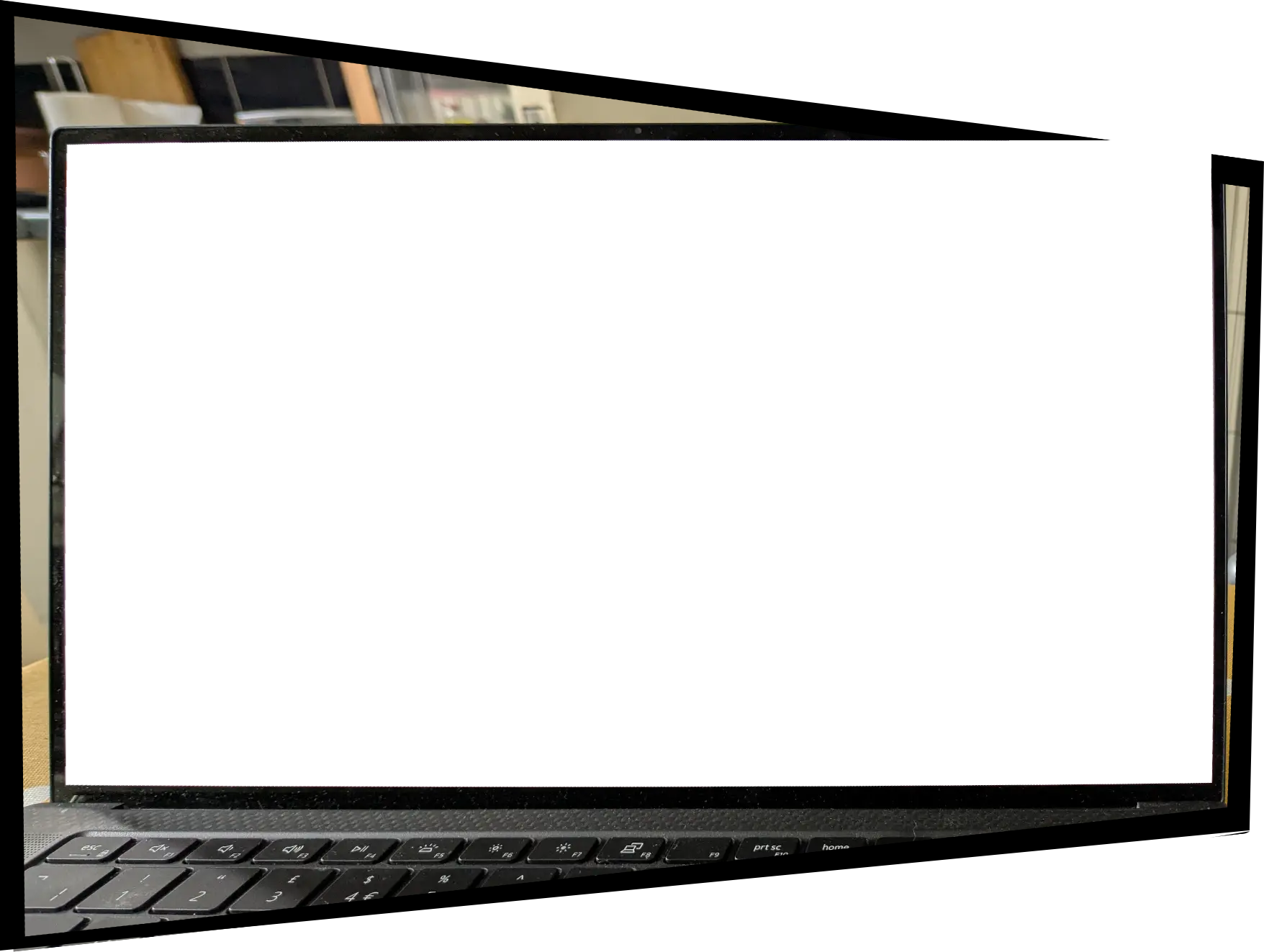
Here’s a short preview clip of the site:
The Process
- An initial consultaton to gather requirements and offer some basic design options
- A quote and estimated shedule of work
- Several rounds of design work and feedback
- Straight to work, initially focusing on the absolute basics
- A couple of check-in meetings at key preview milestones
- Polish - the addition of more animations and effects, final finessing of mobile experience, and a thorough checking over of meta and accessibility requirements
- Deployment!
All in all the process took a couple of months, allowing for client feedback, etc.
Technical / fun stuff
The stack
From the start we planned out a single page app, fully static generated. I also wanted to experiment and find a framework to support that. I had previously worked with Nuxt (Vue), but having lost several fights to Nuxt I decided to choose a new opponent… Eventually settling on Next.js (React).
I had pretty limited previous experience with React at that point, so I had to give it my all. In the end, I learnt a lot, and there’s a lot to be admired in the react ecosystem and the ways next.js works. It got the job done, but it certainly directed my trajectory firmly out towards SvelteKit for future projects.
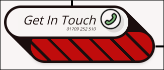
Fun buttons
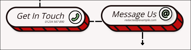
These buttons are entirely build with CSS (aside from the icon) and fluid with the size of their content. I wanted to get these buttons just right - in particular I wanted to avoid any gaps in the outline when the top layer “rises”.
In the end this was achieved with a series of box shadows with gradual calculated offsets based on the --btn-hover-depth. You can even set the hover depth to a really high value and while it might look a little silly, there are still no real gaps in the outline effect:
Scroll driven animations
Each section points at the next section with an arrow, occasionally overlapping the following section. To really sell the effect of movement I used scroll driven animations extend the arrows towards their targets as you move through the page. This affect is surprisingly subtle, but I’m really pleased with how it turned out.
The arrows were all comprised of three parts:
- The tail - An
<img>tag of a little circle - The body - A repeating background image of a single dashed line
- The head - An
<img>tag of an arrow head
By setting the arrows up this way, I could easily remove the head or tail and resize the line to any length I wanted.
Other details and features
- The scroll gallery - Creating a parallaxing collage effect purely with css scroll animations
- Image LQIPs - All images on the page use blurred low quality versions to instantly load in ahead of full quality versions
- Enter animations - Certain animations are triggered with intersection observers on their first enterance to the viewport.
- Mobile / tablet layouts - Knowing that a large amount of traffic would be coming through handheld devices, it was important that all of the complex layouts and arrows would still work flawlessly for those screen sizes. Everything on the site was designed with responsiveness built in with only a one breakpoint to reflow the layout for mobile.