Simonw.xyz - This Site
Well, this is very meta isn’t it?
This site is an ongoing process… A place to get creative, showcase my work, create a presence, a one-stop source of truth for all things Simon and Simon’s work.
So this particular document will need rewriting a few times, no doubt.
Design and Development
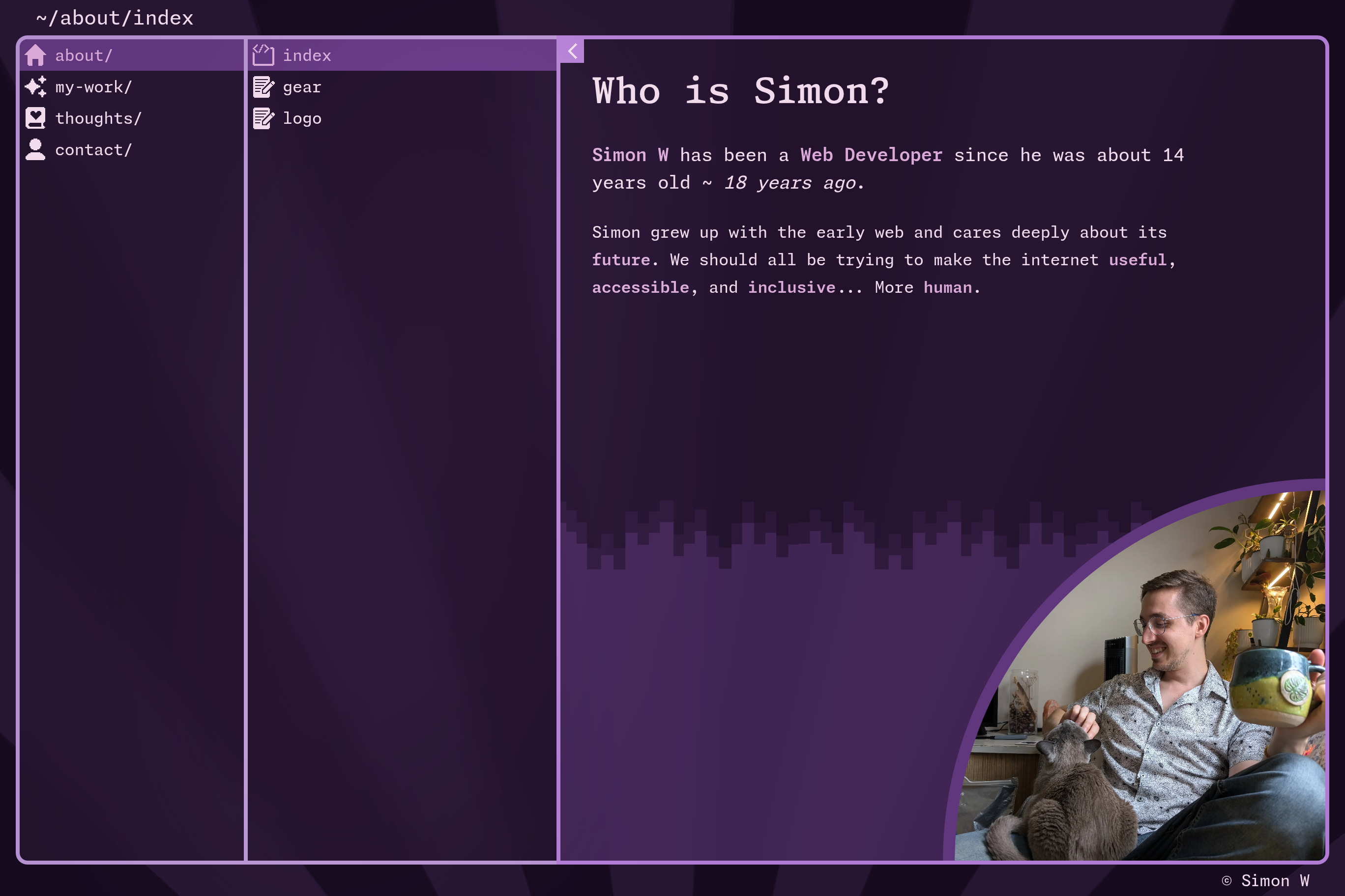
This portfolio takes inspiration from TUI applications and file explorers and is made with Sveltekit, tailwind, mdsvex. Each section of the site effectively represents a folder, with an index page and a series of additional content files.
Currently, the index page is a +page.svelte file, representing the actual location of a page in the directory based router. Then a series of .svx pages can be pulled in and served from a [...post]/ route folder.
This took a lot of initial setup, but I can now easily add new pages (and subfolders), without much hassle.
Fun things
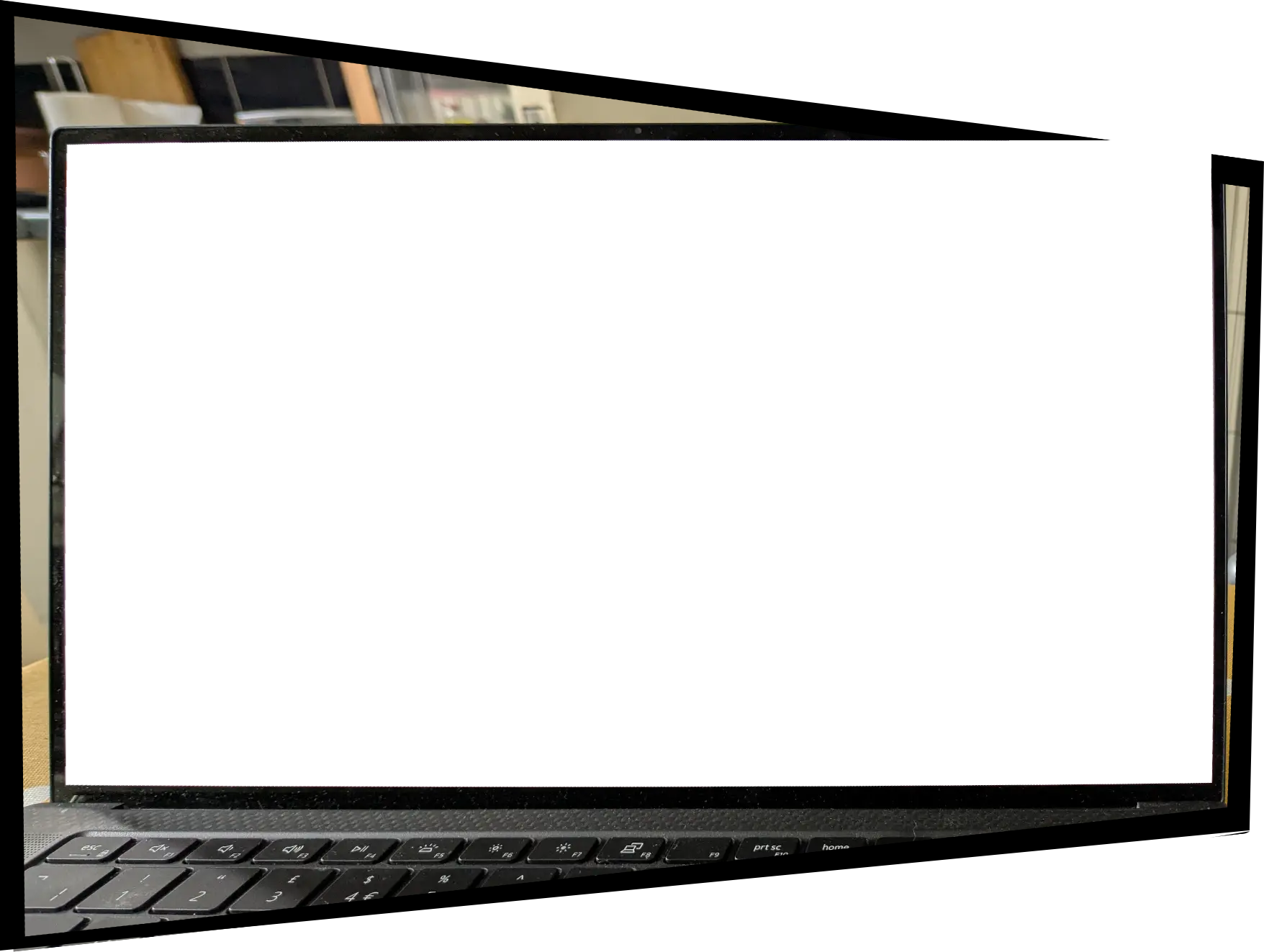
- /about/gear - I got a little silly with this page. I thought it would be fun to see if I could have the user view the site on a piece of my gear: my laptop. So right there and then, sat at my kitchen table, I took a photo of my laptop and cut out the screen using Krita. Following that, I warped the photo such that the rectangle of the screen was more-or-less square, then reapplied the perspective transformation to the entire page’s layout while using the un-perspective’d image as a frame… This was silly. But sometimes you just need to have some fun.
- /my-work - It’s been fun to reflect on some of the things I’ve made which show some creativity, ingenuity, and craft. This section really grew organically, and I’m really pleased with how the index page has come together. The
svxpages use frontmatter, and that metadata is gathered up by the server to generate the index page. It took a bit of wrangling to get it working perfectly - and prerendering makes the output lightning-fast. - /contact - For the first time ever probably this is the location which points to all the places I’m likely to be found on the internet. Complete with aliased email address to avoid spam, external link icons, and quippy one-liners about each link.
- Colour Scheme - A 16 colour scheme generated with Stylix.
- Fullscreen-ish Mode - Click the little arrow in the corner to expand the content column. This idea came to me after a friend had a look at the site and made some helpful suggestions about the balance of content.
- Portrait Mode - If you’re on a mobile, a 3 column navigation layout isn’t going to fit… Unlessssss~ … So yeah, I made the first 2 columns flip their orientation.
- Full Responsiveness - Not only that, but the entire layout can go through several container query based breakpoints to make sure you’re seeing as much of the UI as will reasonably fit on your device. It’s an approach you don’t really see anywhere else yet but it was really fun to figure out. Have a play around with your window size and see what happens.
There’s more to come
I’d love to work on some new posts in the thoughts/ section. There’s lots of other features I’d like to add. In particular I’d like to return to the TUI vibe by adding some keyboard shortcuts all over the place and a command pallete.
Thanks for checking the site out 💖